Fun fonts for children
Struggling to find the perfect font that captivates your child’s interest and enhances their reading experience? The right fun fonts for children can make a world of difference, transforming reading into an enjoyable adventure rather than a tedious task. Many parents and educators overlook the impact of typography on young readers, but choosing the right fonts can significantly improve their learning and creativity. In this guide, we’ll explore how to select the best fun fonts for children, ensuring they are not only engaging but also highly legible for young eyes.
What Makes a Kids’ Font Legible for Young Readers?
Selecting a children’s font involves considering the purpose, target audience, and message or subject matter. The purpose refers to the type of material you’re designing. Are you choosing a font for a children’s book, a pop-up card, or a school poster?
A font also influences the tone or message of your material. Ask yourself: What kind of tone are you setting? Magical, spooky, adventurous, or funny?
Most importantly, ensure the font is legible for its intended audience. Unlike fonts geared toward adult readers, legibility for young readers can vary greatly.
Children of different age groups have distinct needs. Your choice of font will differ for a children’s book aimed at ages 3 to 6, 7 to 10, or 11 to 13. These age groups have vastly different reading levels, so keep that in mind when choosing a font.
Below are a few tips on selecting a legible font for young readers.
1. Avoid Overly Decorative Letters
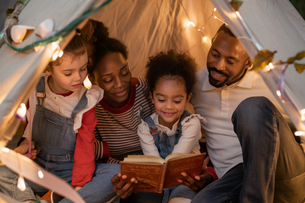
Preschool-age children (3 to 5) who are just beginning to read need help recognizing letters. If a letter is too hard for them to recognize, they may become frustrated and stop reading altogether. Therefore, if you’re designing a book for this age group, avoid fonts that are too stylized and decorative.
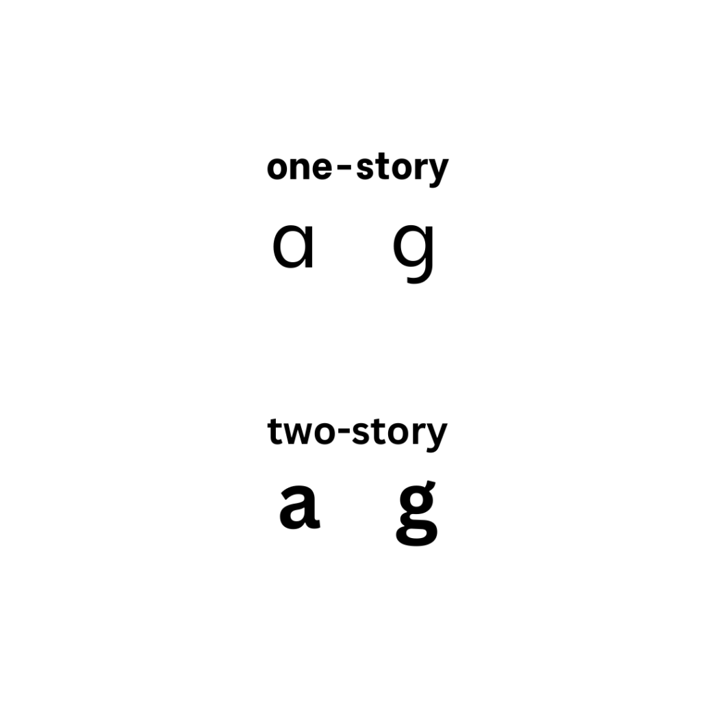
2. Use One-Story a and g
Another important factor is the lowercase a and g. Both letters have two different lowercase styles in serif and sans serif fonts: the one-story and the two-story. The one-story style is typically recommended for early readers since it’s how children usually learn to write these letters, making them more easily recognizable.
3. Keep Your Font Big, Tall, and Rounded
Fonts with tall x-heights are generally easier for kids of all ages to read. For young children, rounded fonts are friendlier to read compared to angular ones. A typical children’s font will be 14-24 points for books, with 14-16 being the most common.
15+ Free Fun Fonts for Children’s Books and Other Kid-Friendly Design Projects
Pop-up books, storybooks, learning posters, birthday cards, and kiddie zines – there are numerous child-friendly craft projects you can create for and with your children. Here are a few free font ideas from Creative Fabrica that you can incorporate into your project, categorized into kids’ favorite genres.
Best Free Kids’ Fonts for Your Fantasy Book
Kids love to imagine fantastical worlds with witches, wizards, dragons, and mythical creatures. These free kids’ fonts can help bring such magical imaginings to life.
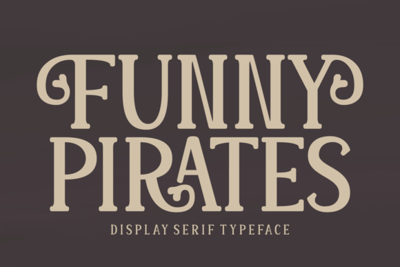
1. Funny Pirates
Perfect for swashbuckling fantasy stories featuring pirates, parrots, ships, and treacherous seas. This serif display font has fun flourishes at the end of certain letters, keeping it playful but readable.
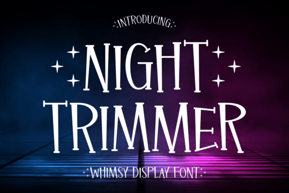
2. Night Trimmer
Creating a storybook set in a whimsical fantasy land? This fun font has quirky magic with its irregular lines. It is an all-caps display font, ideal for cover pages.
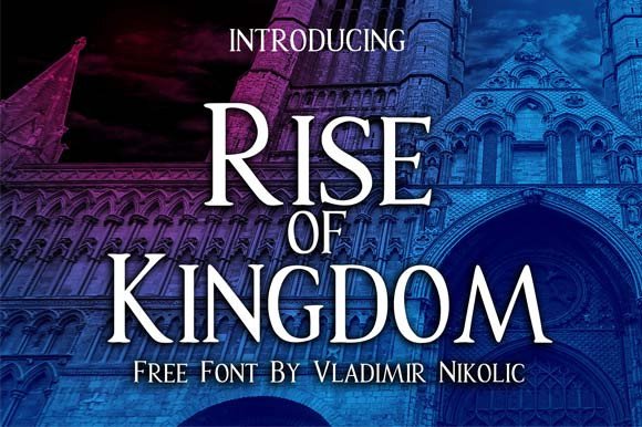
3. Rise of Kingdom
For a fairy tale fantasy book for older readers, this highly legible font looks fantastic on the cover.
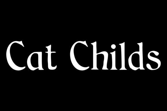
4. Cat Childs
This fantasy-style font is very early reader-friendly with its one-story a and g, perfect font weight (not too thin or thick), and a tall x-height.
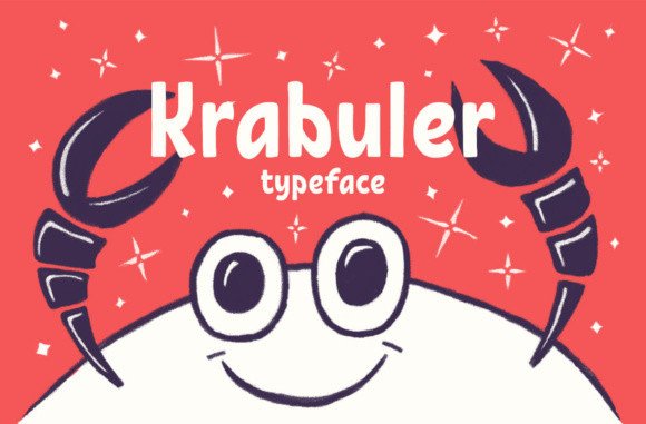
5. Krabuler
This quirky sans serif display font is great for both smaller body text and titles for whimsical stories, with its stylized but readable typeface.
Best Free Kids Fonts for Sci-Fi and Adventure Stories
Superhero and comic book design projects appeal to kids of all ages. Use these fonts in your designs to make them truly pop.
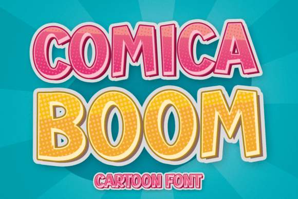
6. Comica Boom
This cool comic book-style typeface with its Ben-day dot details and thick letters will look great as accent letters for your cartoon designs.
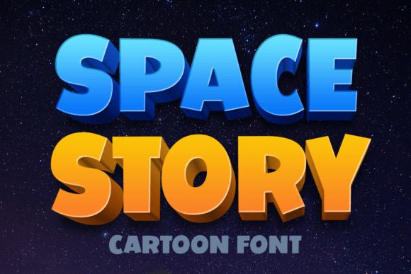
7. Space Story
This display font pops off the page with its thick and rounded letters. Used as a title font or header, it will grab the attention of any kid who loves outer space.
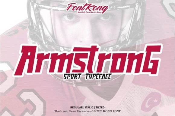
8. Armstrong
For sports-loving kids, this display font makes an instant impression. It also has a strong anime vibe, perfect for genre-inspired crafts.
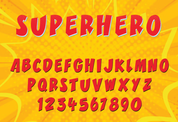
9. Superhero
Reminiscent of superhero comic book typography, this easy-to-read font with quirky characters is perfect for superhero designs.
10. Robots
Older kids who love sci-fi adventures in space will love this cool display font. It’s great for book covers, shirts, posters, zines, and other design projects.

Top Free Children’s Fonts for Horror
These fonts will delight kids who love Halloween, telling spooky stories on sleepovers, and creating tales of defeating monsters.
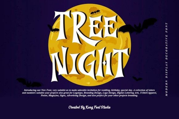
11. Tree Night
Fun Halloween-themed books or designs will be more eye-catching with this fancy serif font. Its unique details and irregular angles resemble retro Halloween designs.
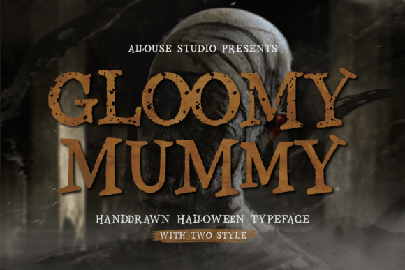
12. Gloomy Mummy
This font duo features two styles of this Halloween-inspired serif font, giving you more design options. Its hand-drawn style will attract kids who love Goosebumps and other spooky titles.
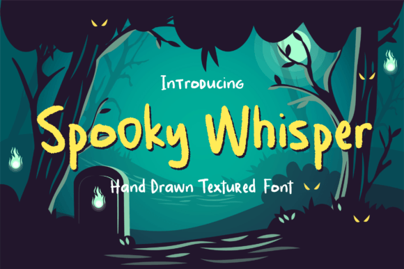
13. Spooky Whisper
This textured handwritten font is not as spooky as its name suggests, making it perfect for cute Halloween stories for younger readers.
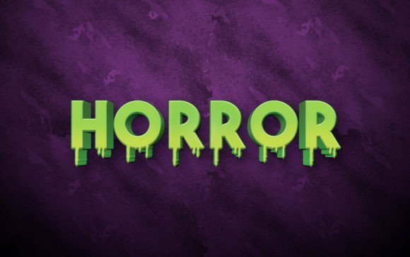
14. Horror Font
This font might be too scary for younger kids. But for pre-teens aged 10 and above, this display font with its dripping bottom detail will spook them in a playful way.
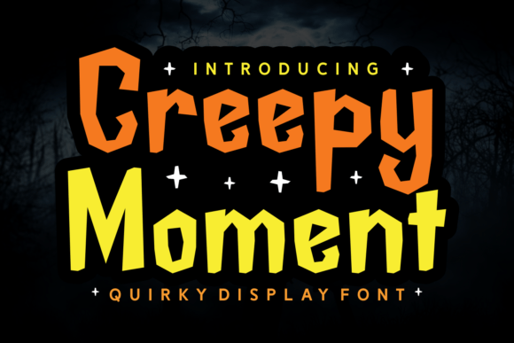
15. Creepy Moment
The irregular lines and details on this display font bring to mind Frankenstein’s monster. It’s perfect for cute and fun Halloween designs featuring monsters and ghouls.
In conclusion, choosing the right fun fonts for children is essential for making reading and creative activities engaging and enjoyable. The right font can transform a simple book or craft into an exciting adventure that captures young minds and fosters a love for learning. This guide has explored various tips for selecting legible fonts and provided a curated list of free fonts suitable for different themes. By understanding the importance of font selection and considering the needs and preferences of young readers, you can create materials that are not only visually appealing but also developmentally appropriate. Remember, the key to successful design for children lies in balancing fun with readability.



Leave a Reply
You must be logged in to post a comment.